I love prototyping.
It is the best way to evaluate designs, and it exposes and reveals design assumptions (both known and unknown). A design can look good, and seem good, and explain well, but once it’s in a prototype – even a simple one – flaws become easier to spot.
Now, I know I sound a little crazy for saying “I love prototyping because it makes mistakes obvious”. Who wants their mistakes to be obvious? But I am firmly on the side of “prototype early, and prototype often”, because I want to find mistakes before they go any further.
Picking the right tool for prototyping is key to having a successful prototype.
Paper prototype
I’m talking about this first since it is the “simplest” form. In my human factors program in college, we did this quite a lot, but as a UX designer who works primarily within a design system, it is not my first choice. Paper prototypes are fantastic when:
- Testing new patterns
- Testing novel form factors
- Testing physical devices
It is far cheaper to draw a physical button on a post-it than to construct one.
However, when working with a digital experience, the manual cutting & pasting of a paper prototype takes more time than a lightweight click-through prototype, so I usually jump ahead to that.

Simple click-through
I find that a “simple” click-through prototype generally provides the most “bang for the buck” when it comes to prototyping choices.
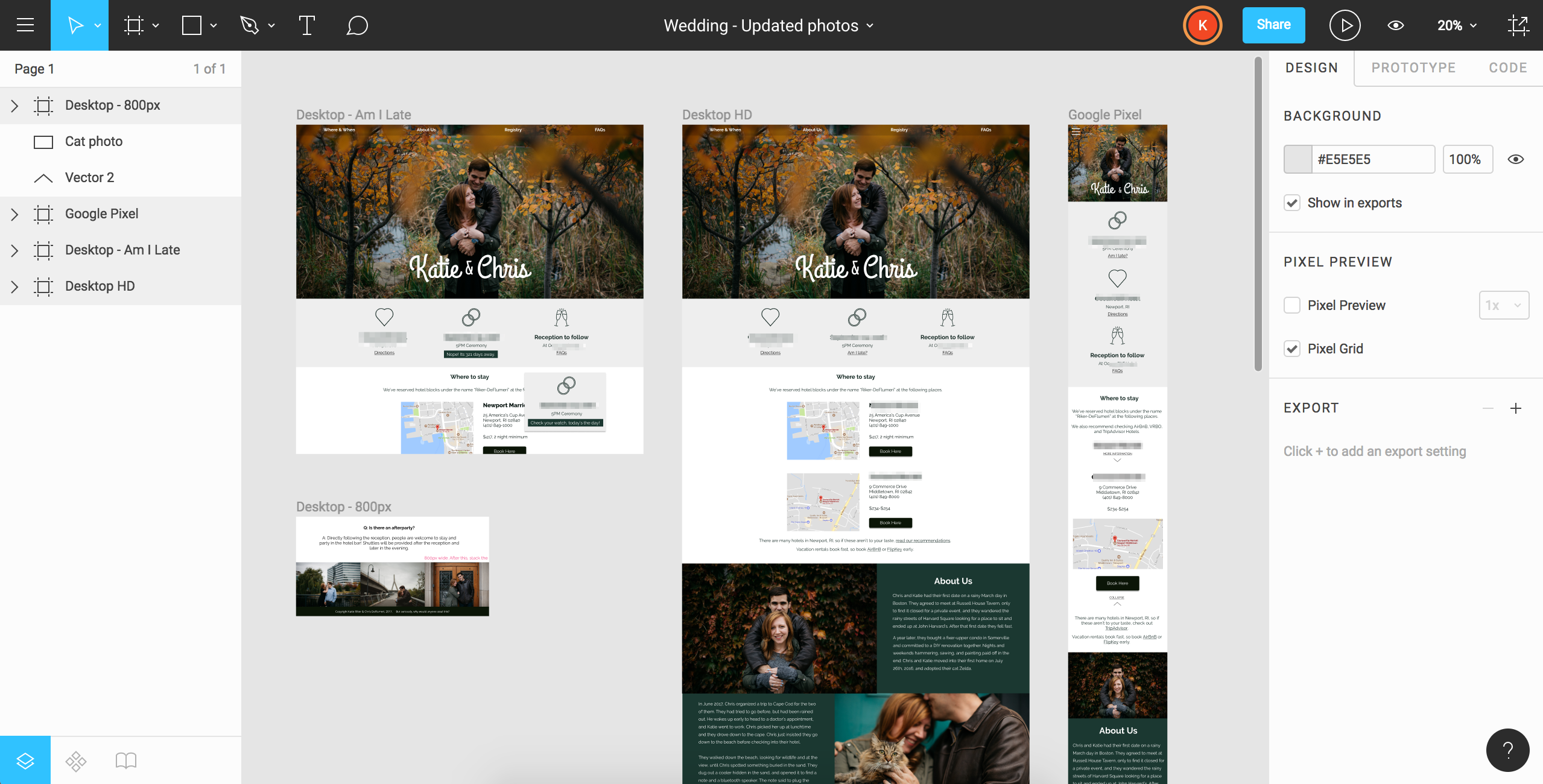
For novel experiences, I start with greyscale wireframe-like flats. For things that are more mature or more familiar, I start with flats which match the color and overall look & feel of the design system it is going into. This makes something that is “real-enough” without too much additional work in crafting a prototype.
Watching and observing users interact with a series of flats reveals not only information on what you wanted to test, but also information adjacent to your main goals.
I’ve used Marvel and XD to make these prototypes and test users.

Interactive prototype
An interactive prototype that looks and behaves like the real system is the holy grail of prototypes. Unfortunately, it requires more effort and time investment than the others.
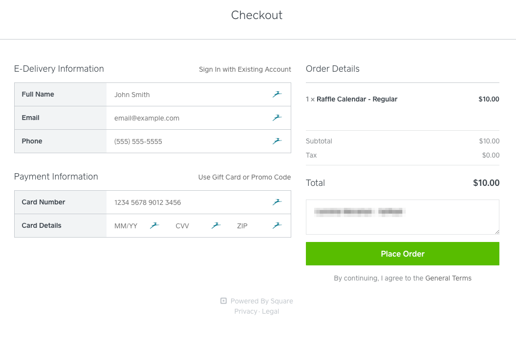
Generally I use interactive prototypes when testing things that involve data entry (users being able to actually type is great for getting meaningful results) or has visual interactions that are difficult to mock up in a simple click-through. (And is easier to write in HTML/CSS/Javascript than to create a gif!).
Today, I will create these in HTML or work with a developer for more robust code, but I have experience using Axure to create these prototypes as well.


Leave a Reply