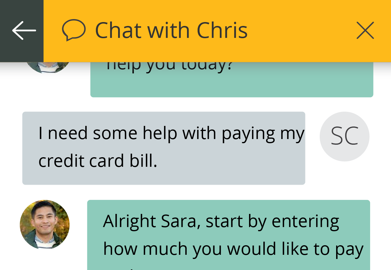
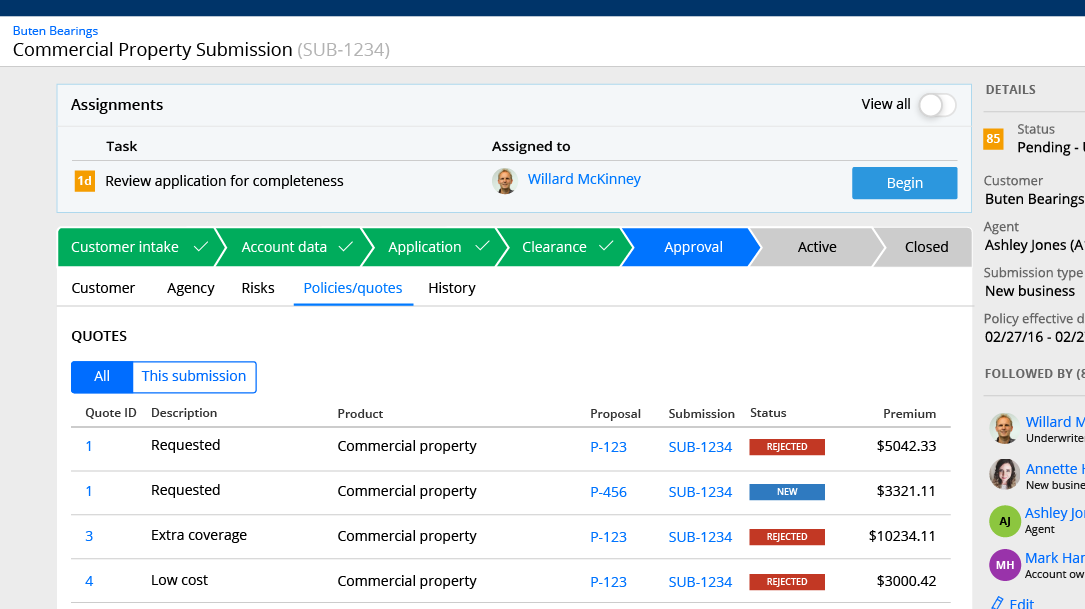
The goal was to create an interaction for talking to an agent, or otherwise seeking help, while on a mobile device.
The designer I collaborated with had a simple version of this for the desktop (with a gchat style corner chat window) and I was tasked with bringing this to a phone-sized device.
Using the upper right-hand corner as a quick access to help on all screens allowed for the help to be returned to without changing the user’s view significantly. Other solutions (such as the Facebook “chat heads” model, or shifting the screen down) would take up more screen real estate and block the user’s actions more.
This interaction has some downsides (the dedication of the upper right to chat being the biggest one!) but worked very well for the needs of this use case.


