What is this application?
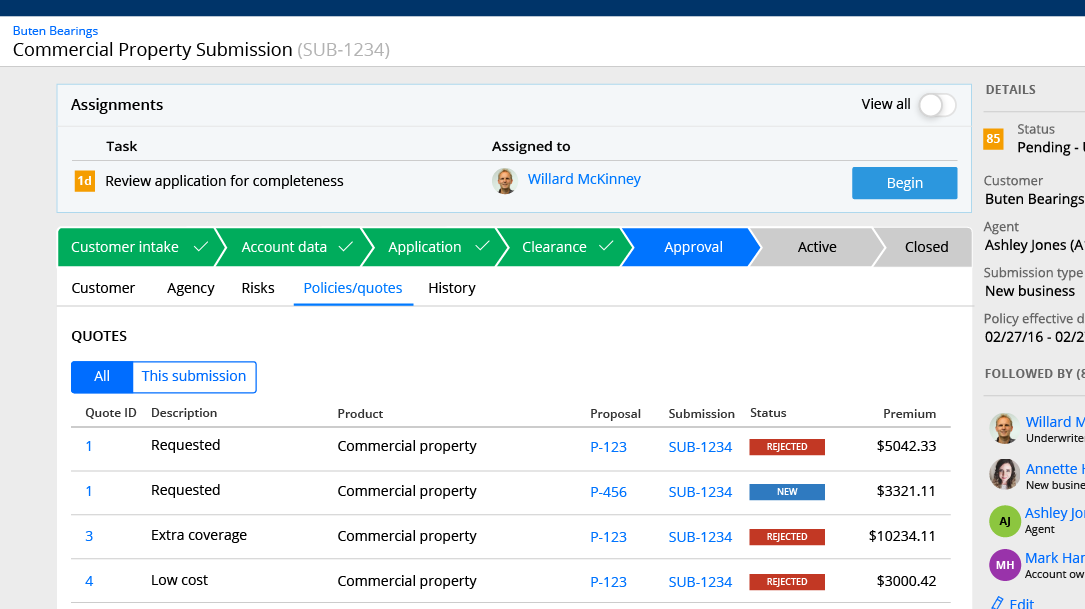
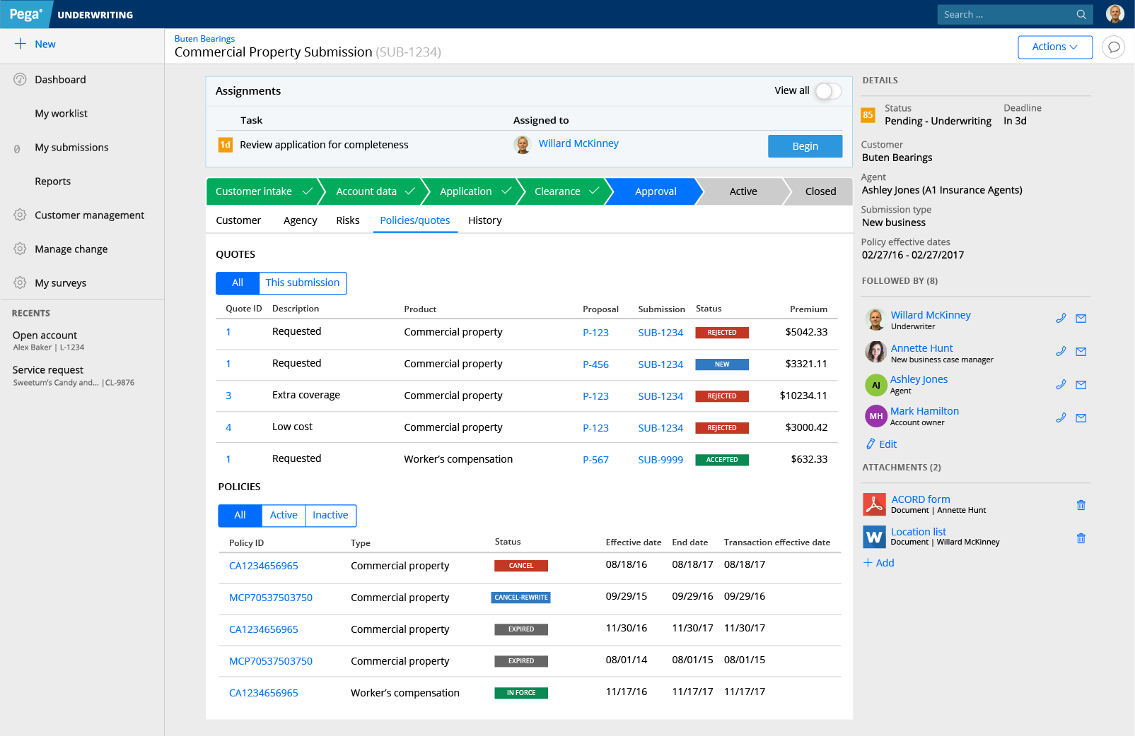
This is an application that helps insurance underwriters determine how much to charge for a specific commercial insurance policy. This particular underwriting application takes a policy submission through a large portion of the process: from initial information capture to analysis and underwriting decision making.
This application was developed over years, and as is typical for anything developed over multiple years, it started simple but added many more features and options over time. This created additional complexity in an already complex process. The development team was struggling with maintaining disjointed areas of the application. Redesigning this application allowed us to simplify the user’s process while also maximizing development reusability.
Process
Heuristic analysis & research
To get an idea of what challenges this comprehensive redesign had, I started with a heuristic analysis of the existing application.
Key issues
- Inefficient use of space & complex structure.
- Long and complex process with unnecessary “clicks”.
- Inconsistent user experience from screen to screen.
- Developed patterns in one line of business weren’t applicable to others; meaning that each line of business needed custom design and development.
Identified application needs
Initial research for this redesign was primarily with internal stakeholders. There was initial interest in a small redesign of some areas, but with the results of the heuristic analysis in hand, I was able to demonstrate the need to tackle a more complete project.
With this group, we identified goals for this application.
- A powerful and complete application. Strategically, this application is meant to replace a variety of applications underwriters currently use.
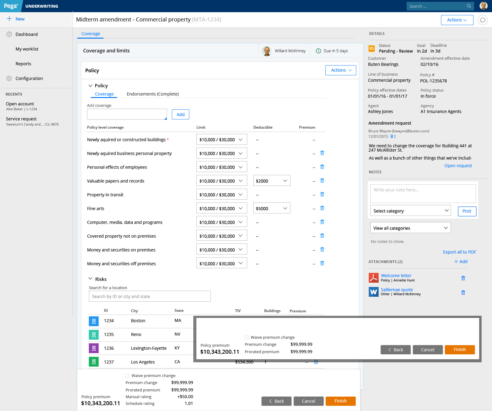
- Faster data entry. Commercial insurance submissions can be incredibly data heavy. This application needed to support fast manual data entry as well as importing data from spreadsheets.
- Clean, intuitive experience to help new users get on-boarded fast. Underwriters shouldn’t be spending time fighting a bad UI: they should be making informed business decisions. A great UX combined with future AI powered decision making aims to make “every underwriter, your best underwriter”
Benchmark testing
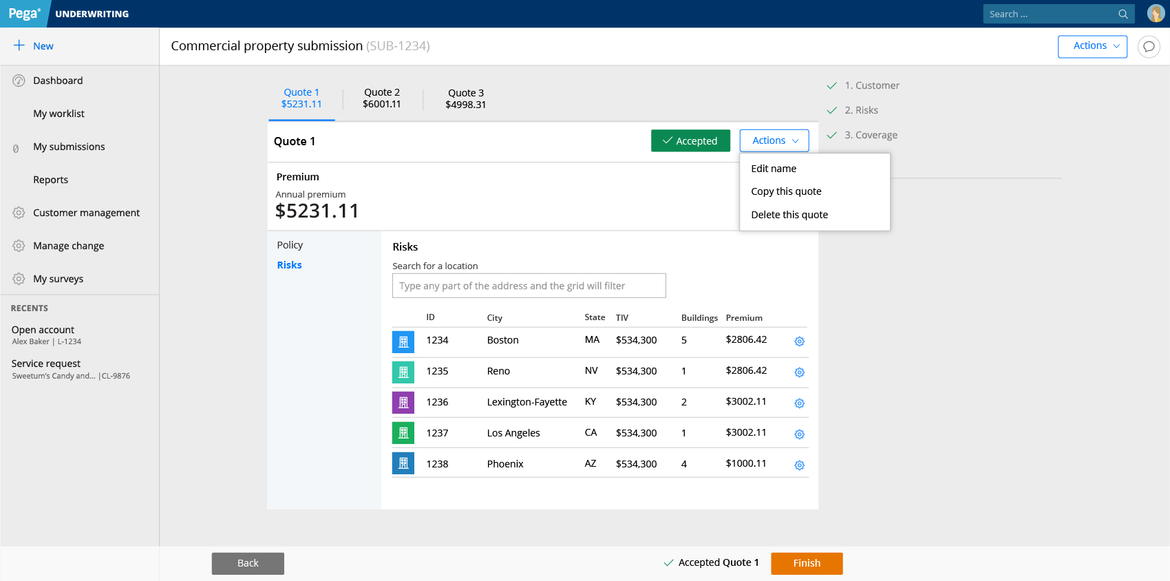
Certain parts of this application were more problematic than others. My heuristic analysis found that the process of creating and duplicating quotes was a problem area. To ensure that any redesign improves this area, I did specific benchmark testing on this feature.
Users were given a variety of tasks related to navigation. Most of these were locating a piece of information or navigation element. The sessions were recorded and tasks were coded by time as “success” or “failure”. Identification tasks that took more than 10 seconds were coded as a “fail”.
This testing confirmed that there were serious navigation issues in this area. This area became a main focus of the redesign effort.


