What is this design system?
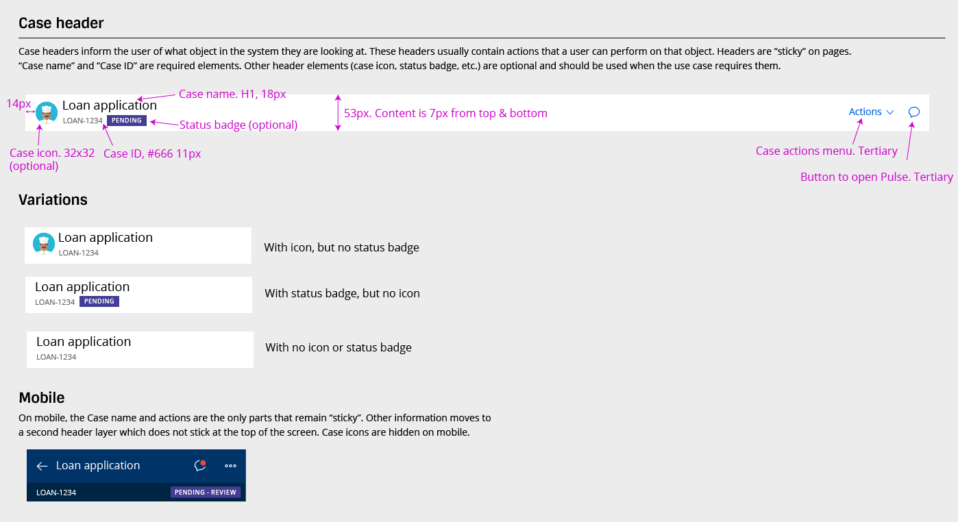
The Pega Design System and UI Kit assists product design and development teams in three continents create good, consistent UX. The system is consulted by sales and consulting members at Pegasystems, partner companies of Pegasystems, and anyone who is interested in learning more about design at Pega.
The UI Kit is a framework of reusable UI assets that ships with every instance of Pega. All new applications built with Pega automatically use the UI Kit as their base, making it important for this base layer to be well-designed and easy to extend.
Why
Updating and maintaining this design system ensures that the latest in patterns and best practices are always included. The system also addresses specific widgets and elements to solve the problems that people have faced in application development.
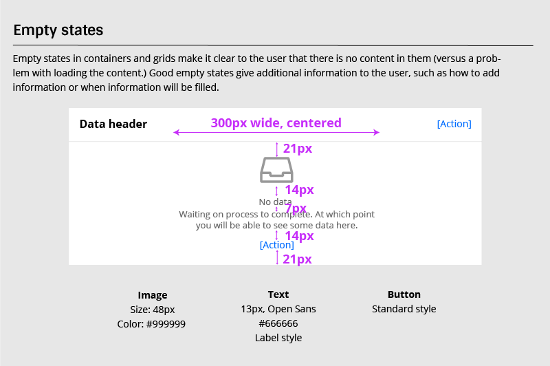
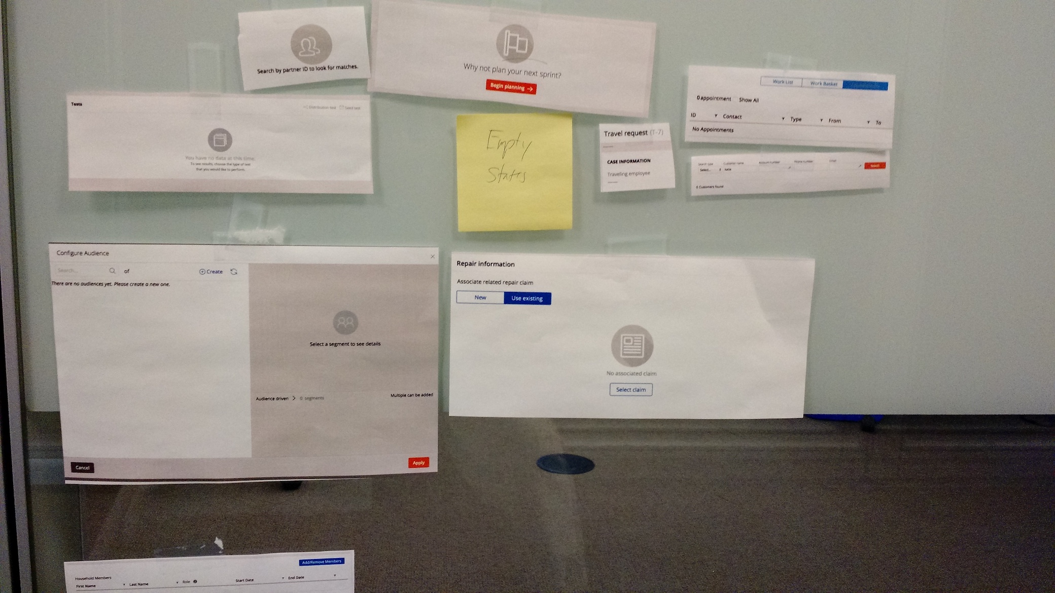
One problem recently solved was that of empty states. The empty states across many applications were all just-a-little-bit different. They also were difficult to build and maintain (the icon style required a drawn drop-shadow!) I took each of the different variations, as well as the problem with complexity, and boiled it down to one simpler design.
Process
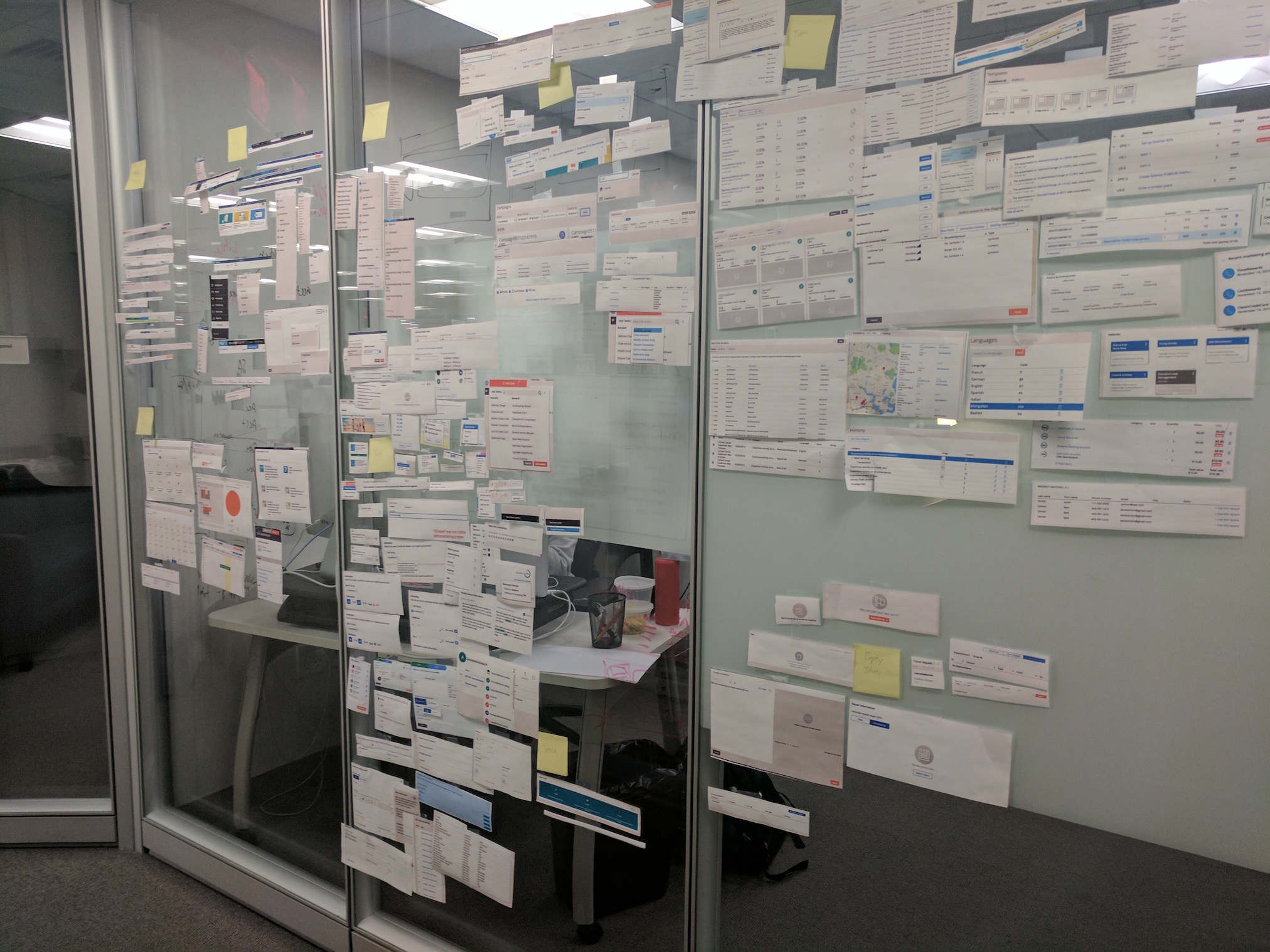
The design system was originally launched with a bare-bones amount of information. To expand this system and make it more useful for designers and developers, I collected together screenshots and views from all the key applications at Pega. Analyzing and synthesizing this information led to drafts of reusable patterns. With these drafts, I organized critique meetings with the varied group of stakeholders this project had: product designers just out of college, UX designers with 15+ years of experience, sales people creating custom demos, and consultants who work with customers to extend base applications.
Results
After critique, patterns were updated and tested (internal testing for now). Each pattern was documented and spec-ed in order to get it ready for development in the UI Kit.
