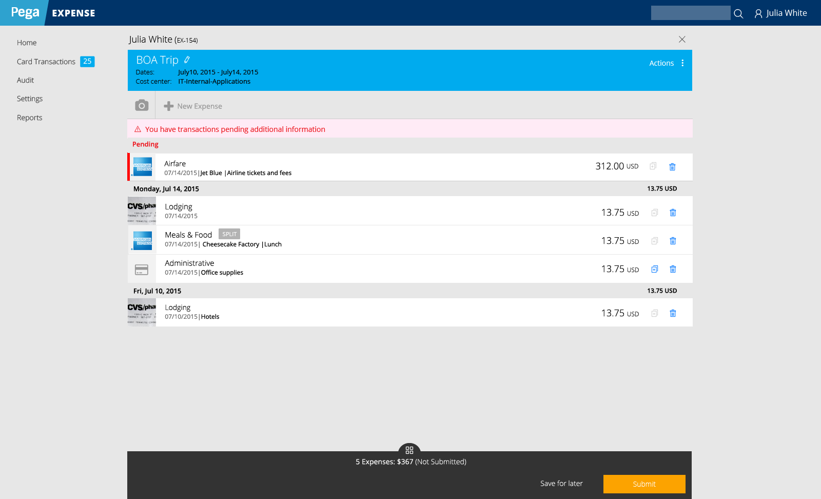
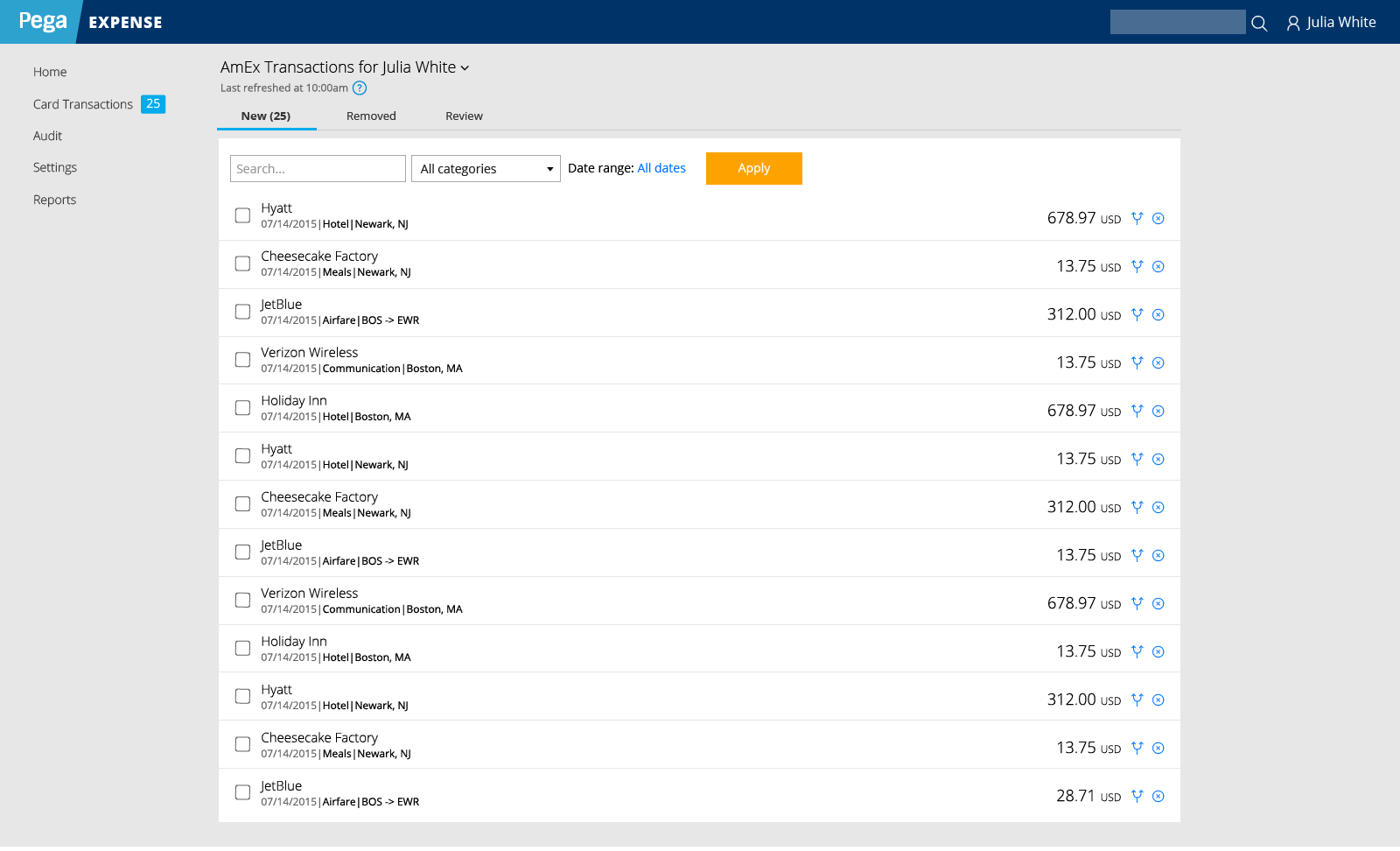
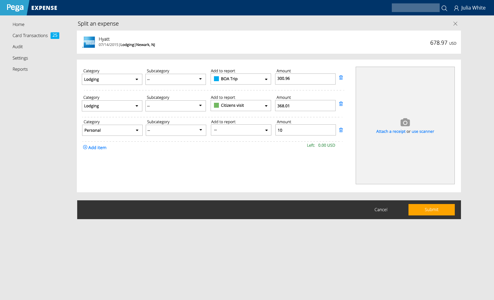
People who travel frequently are also frequently filling in expense reports. In order to reduce the amount of work and effort involved in doing this, we looked at how to integrate purchases on a corporate Amex card into the expense reporting application.
Designs were well received, usability testing went well… but this project never came to fruition due to issues outside of the design.
Issues
First, the integration with Amex wasn’t instantaneous. If a person swiped their card for lunch, the actual expense might not show up in the system until days later. The development team could not figure out an accurate way to match expenses with the given card transaction in the case that the receipt was uploaded before the transaction posted. This left a lot of room for error and forgetfulness.
Second, no one wanted it! Heavy travelers were resistant to using a corporate Amex card as it would interfere with collecting rewards points. The rewards/hotel points that these travelers earned were considered a perk. These heavy travelers tended to be remote workers, so they were left out of many conversations and interviews on this topic.
The resistance to this integration was surprising, but a great lesson on how UX should focus on what people need more than what we think they want.
Heavy travelers wanted their expense reports to be easy, to keep their rewards points, and get reimbursed on time. The proposed integration would potentially have made things easier, but by sacrificing rewards points and potentially extending the time till reimbursement (need to wait for the transaction to post!).
This project was shelved in the end, due to resistance from users.
